Horowitz Pharmacy — storefront signage · nj, usa
A complete storefront transformation for Horowitz Pharmacy in New Jersey: redesign of the façade signage to improve street visibility, modernize brand perception, and build a stronger commercial presence in a high-traffic urban environment.
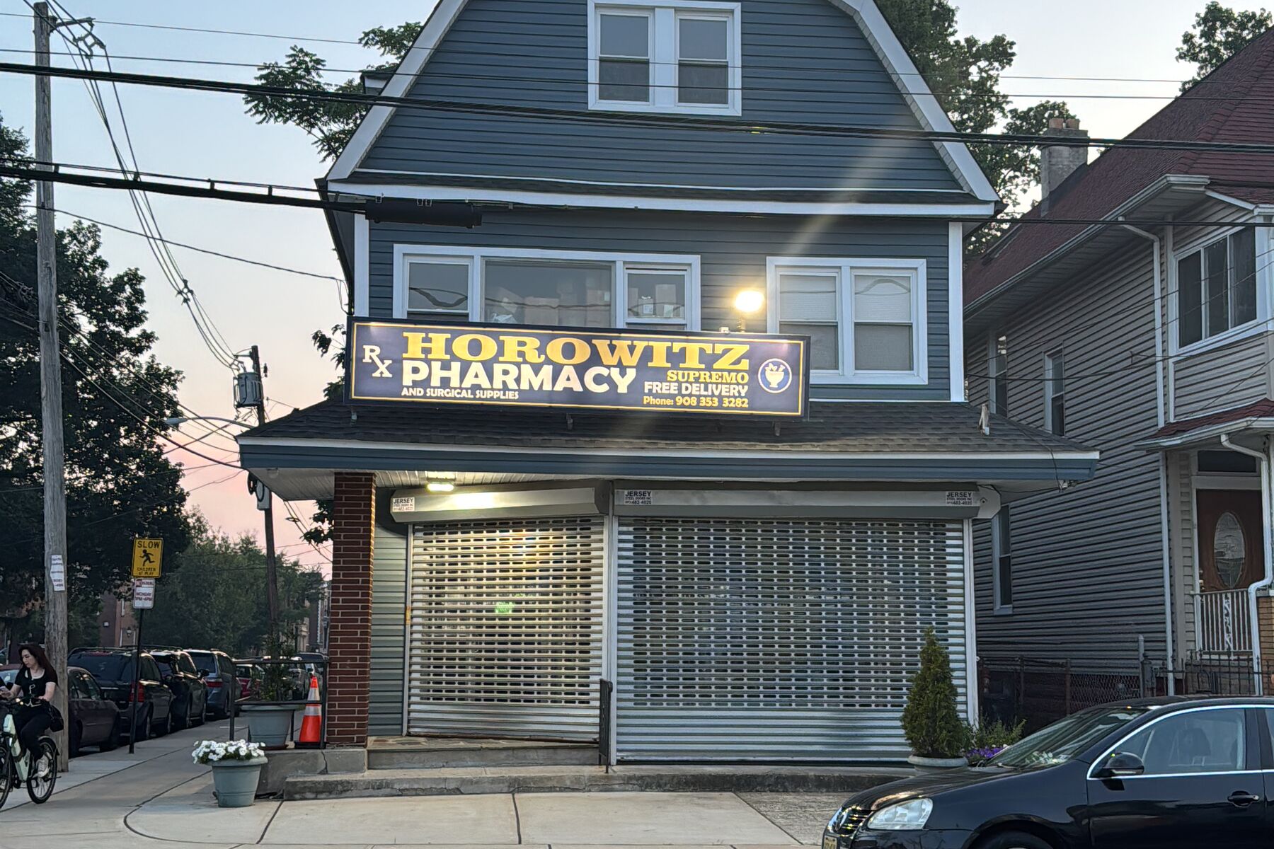
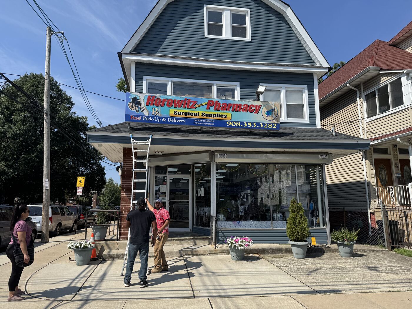
A façade with no hierarchy or visibility.
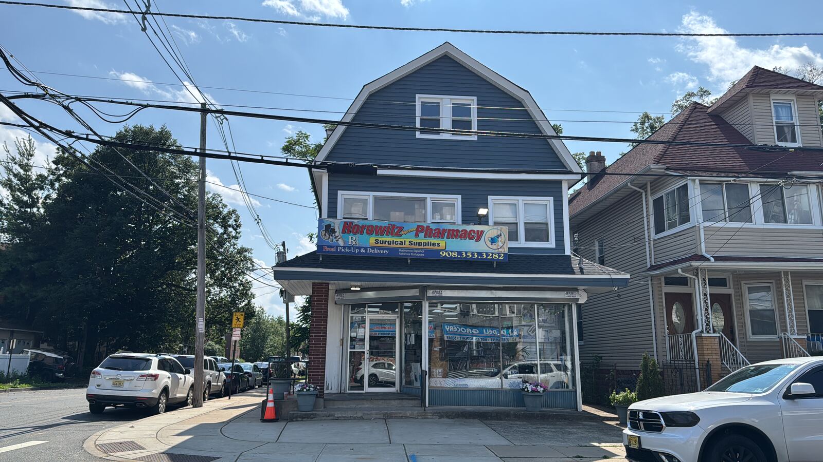
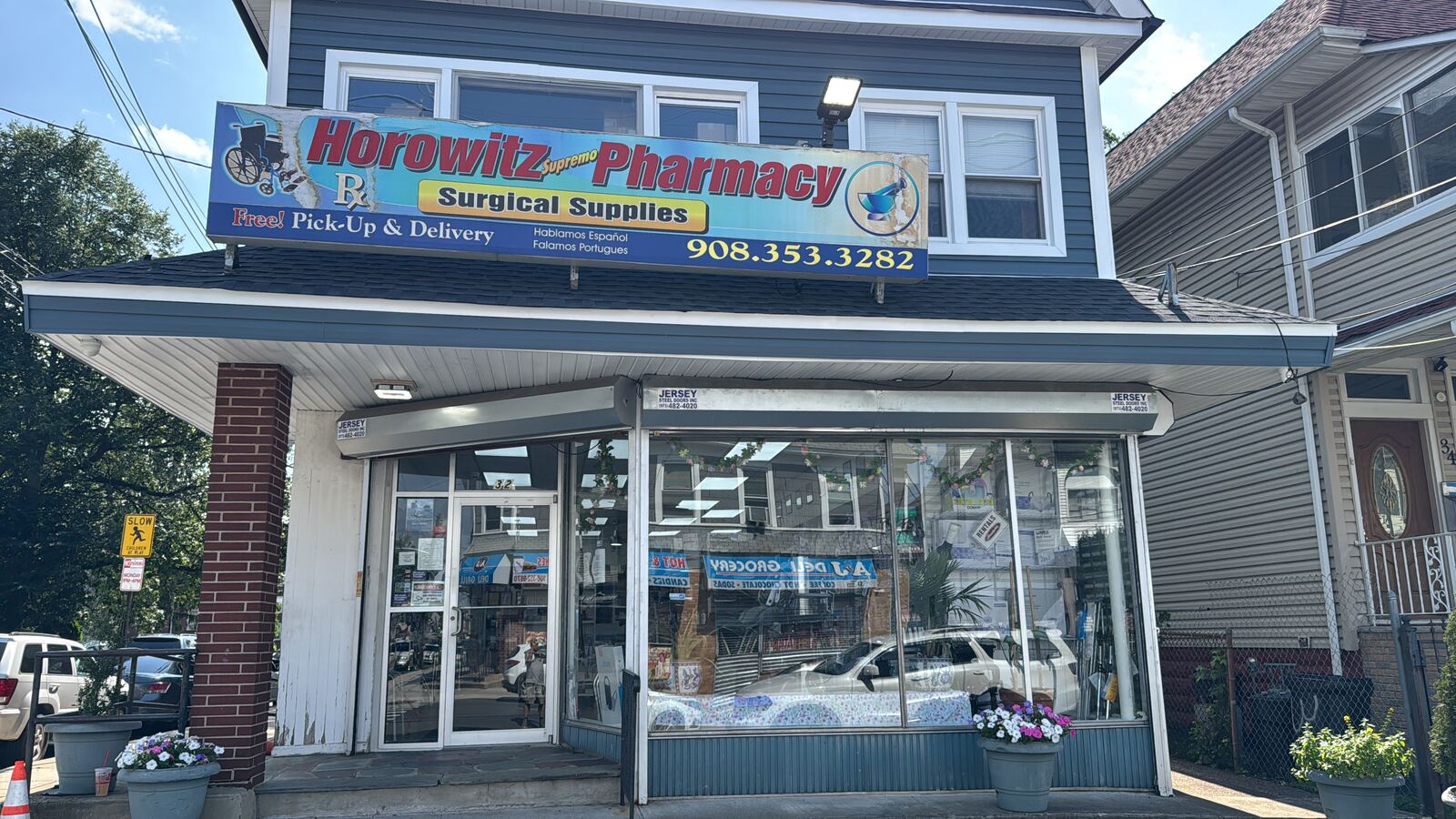
The previous signage lacked hierarchy, consistency, and long-distance readability. The storefront needed to stand out on a high-traffic street and project a more professional identity.
The brief: redesign the main façade signage for stronger visual impact — readable day and night — and plan its production and installation under real-world conditions.
Design, visualization, and installation.
We explored a dual-signage system to maximize visibility from multiple street angles and developed a realistic architectural render to validate commercial impact before production.
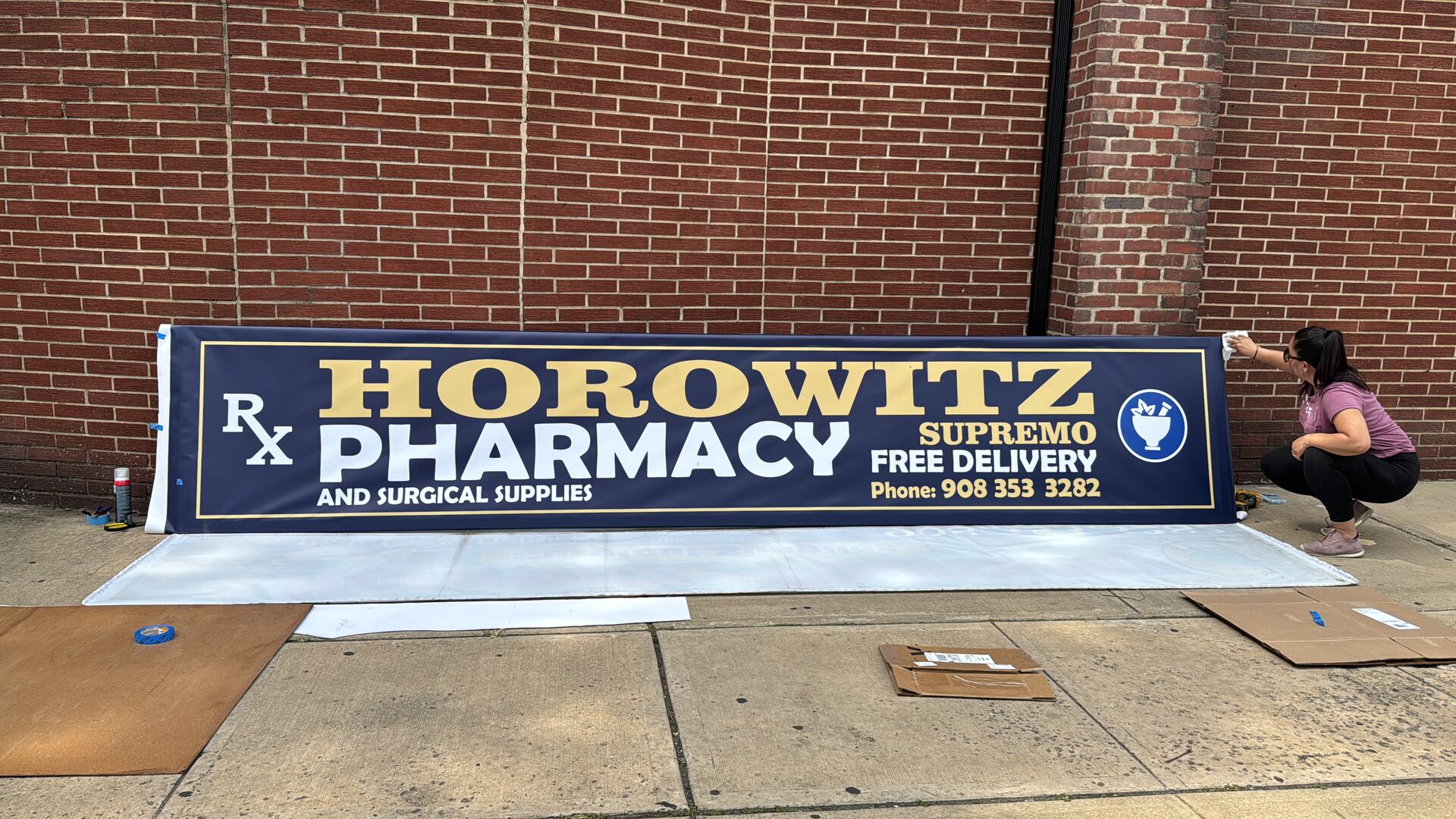
A navy-blue and gold palette was chosen to communicate professionalism, trust, and premium positioning, with typography and contrast optimized for distance reading.
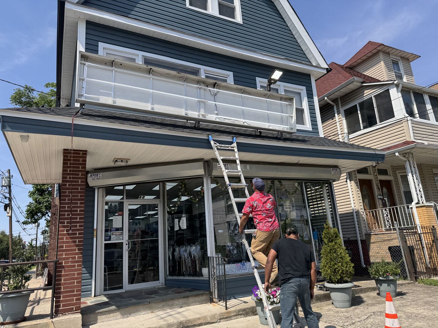
Large-format production used durable exterior materials. Installation included removing the old sign, façade preparation, electrical integration, and mounting the new illuminated system.
A storefront you can read from the street.
A complete storefront transformation for Horowitz Pharmacy: main-sign redesign, architectural visualization, large-format production, and final installation — a cleaner, more professional identity, readable from a distance by day and by night.
- Visual identity enhancement
- Storefront signage redesign
- Architectural visualization
- Large-format production
- Installation planning
- Final implementation
The starting point.
The previous signage lacked hierarchy, consistency, and long-distance readability. On a high-traffic street, the pharmacy went unnoticed by both pedestrians and incoming traffic.
Navy and gold, built to last.
The navy-blue and gold palette communicates professionalism, trust, and premium positioning. Typography, proportions, and contrast were optimized for reading at multiple distances, and large-format production used durable, illumination-compatible exterior materials.
Removal, preparation, and mounting.
Installation began with the complete removal of the existing sign, followed by structural preparation of the façade, electrical integration, and aligned mounting of the new illuminated system.
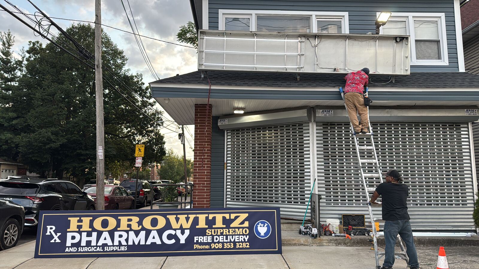
Integrated with the architecture.
The new sign arrived printed and assembled for on-site mounting: structural alignment, electrical hookup, and final adjustments for a clean finish fully integrated with the building's architecture.
By day and by night.
The new storefront transformed how the business reads: long-distance legibility, a stronger commercial presence, and an illuminated sign that holds its visual impact through the night.
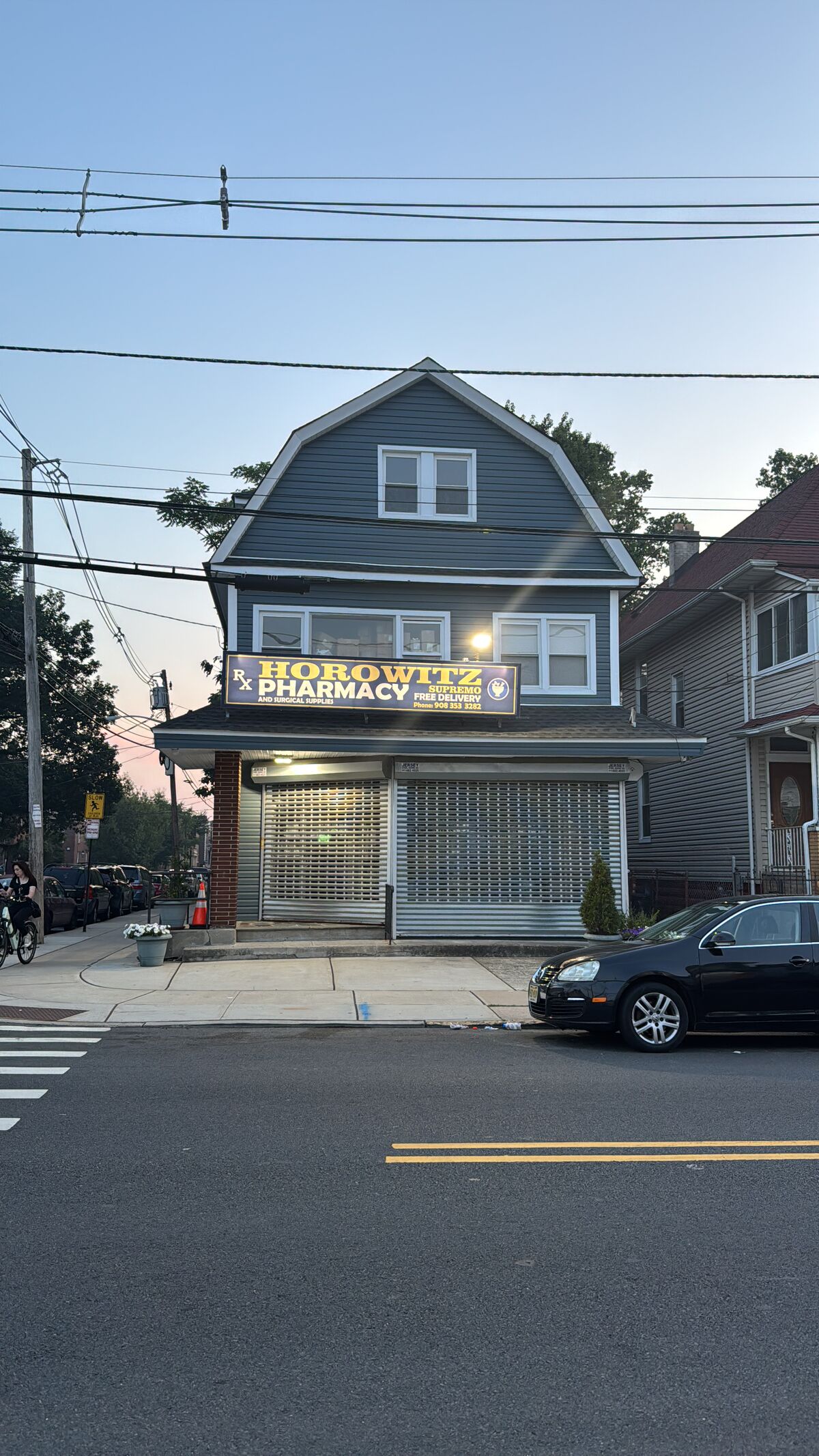
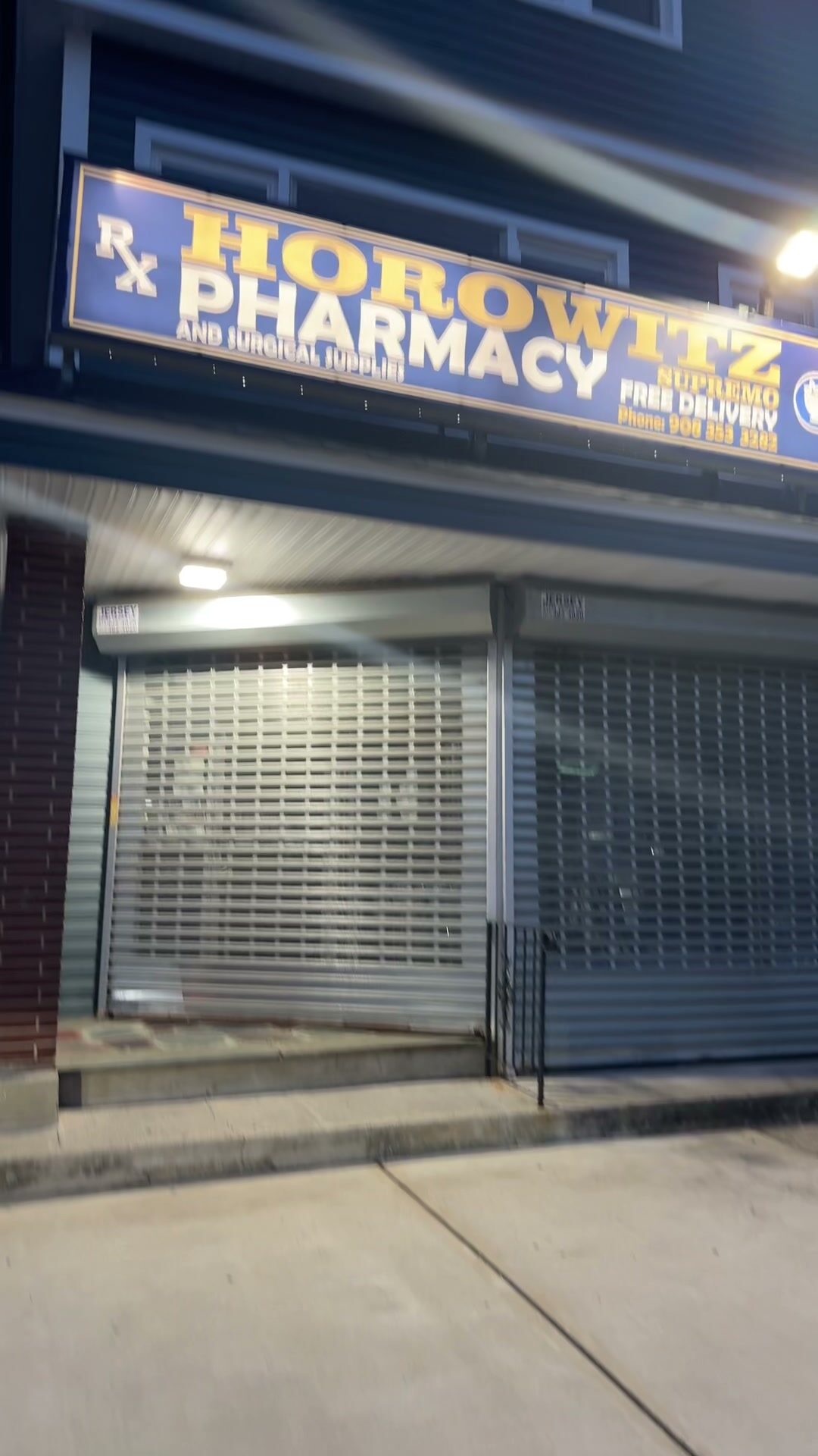
Modern identity. Stronger presence. Better visibility.
The new façade achieved a stronger visual identity, improved commercial visibility, and a more professional street presence — combining design, visualization, production, and installation into a complete environmental-graphics solution.